Friday, June 4, 2010

Lab 9: Census Data


Population information is vitally important for the government when it comes to the allotment of funds to different districts. It also helps to show trends in demography across the nation, especially amongst different ethnicities.


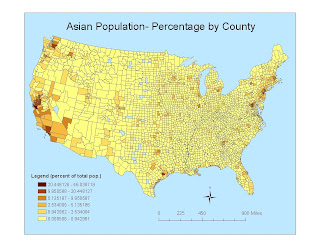
In the United States, the percentage of Asian people in the entire population ranges from less than 1%-46%. Their group has a significant presence in the West, and to an even greater degree of detail, they're main location is in coastal locales, with little to no points appearing in the South or East. The primary location of the highest percentage of this race can be seen in California, specifically the San Francicso Bay area and the Los Angeles County region. Some small numbers can be seen in Florida and the very edge of the Northeast, states like New York or Massachusetts, but it seems as though areas with the high percentages for this ethnic group are very few and mainly found in California or Washington.


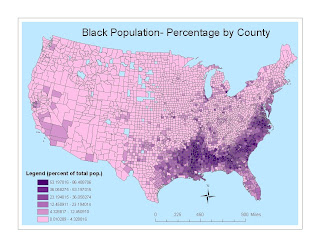
A map of the black population shows similarities to that of the asian group, but there are striking differences as well. While the black group has a significant showing in Southern California, its presence in the South is much more substantial than the previous ethnic group. And, as a percentage of a total population, they have a much higher scale, ranging from less than 1%-87%. Their group's range covers most everything to the east of the Mississippi River line, and their concentration is obviously much greater, since their highest percentile is almost twice as much as the asian populaiton's. They too do not have a prominence in the Midwest, nor do they have a large spread in the nation's North, but their numbers in general show a farther reach across the United States than either of the other two groups.


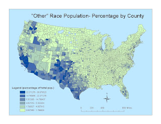
The last category, "some other race alone," is vague in its coverage, but helps to fill in a bit where the two previous groups lacked in residence. This group has prominence in the West, but with a greater overall span than the asian population. The numbers span from less than 1%-39%, with a prominent showing in the western United States. From the south of Texas to the north of Washington, this group's highest three percentage intervals are heavily evidenced. New Mexico, California and Texas are the main sites for residence, as evinced by the darker polygons (ie, higher population concentrations) in their boundaries. They follow the trend of the prior two demographic maps, with sparse groupings on the East Coast, and barely noticeable sightings in the Midwestern region.


These three thematic maps, in essence, cover the overwhelming majority of the United States population. Their large numbers and high concentrations, however, have specific locations and are situated in sprawling areas that overlap. From North Dakota down to Oklahoma, over to Indiana, there is a noticeable void. The midwest, while certainly populated, doesn't really have a place in these three maps. The relative "border land" presence of the asian, black and "other" populations could be due to historical settlement or a fairly close proximity to locations of entrance into the country, but for lack of a more concrete reason, one cannot fully explain the gap in midwestern coverage. If a more extensive mapping was done, that included all races covered in the census, our nation might be more completely colored in with population percentages, but with just these three completed, we have some locations lacking. But all in all, it is nice to see where various populations are present across the US.


Working with GIS has taught me a lot about extensive mapping, but also about the advances in technology that have made it so easy. With ArcGIS software, caluclating population densities, or pinpointing landmarks go hand in hand with land use and terrain analysis. And instead of having to manually calculate every aspect of the data, using secondary sources and pre-programmed tools simplifies the process into a short, five minute task. Prior to this class, and working with ArcGIS, my perception of mapping was limited, or rather that mapping itself was a limited endeavor. Yet every week I've come to realize not only the depth, but the wide range of mapping topics. It's impressive to see how broad GIS can be in its coverage, and how focused you can then make it once you've narrowed your topic choices. While I don't think I'm at the point of mastering the software (I still very much need some more experienced assistance), I do feel like I have a decent grasp of ArcGIS and GIS as a discipline to accomplish what small tasks I may encounter.

Monday, May 24, 2010

Lab 8- Station Fire


The Station Fire began on the afternoon of August 26, 2009, in the Angeles National Forest near La Canada, CA (specific coordinates are 34.251, -118.195). The fire, which started less than a mile from Angeles Crest Highway due to arson, is the 10th largest in California since 1933, burning a total of 160,577 acres (Incident Information System). The terrain of the area is considered "steep and extremely rugged" with thick conifer trees that retain heat, numerous standing dead trees, and a considerable layer of debris and leaf litter that allowed the fire to burn more easily, while also making it harder to extinguish. The fire was deemed fully contained, meaning there were no longer flames or heat present in the burn area, on October 16, 2009, 2 months from its inception.

Vegetation went up in flames and the ground lay torched and blackened as 250 squares miles of the San Gabriel Mountains succumbed to the fire. And while Angeles National Forest has only temporary residents in its ranger stations and campgrounds, many of which were destroyed as the fire progressed, dozens of adjacent communities were expecting the worst. The origin of the Station Fire was calculated to be one mile from the ranger station at La Canada Flintridge. As the fire grew, consuming trees and leaf litter left from years of dormancy, its perimeter spread quickly northward, eventually extending to the northern edge of the forest, as well as making its way east and westward. One of the biggest fuels for the fire was the dry Santa Ana Winds that sweep downward toward the sea off the San Gabriel Mountains. Because heat rises, and since the location of greatest fuel (oxygen) can be found at higher elevations, forest fires are prone to moving uphill, which the Station Fire did as it moved from its point of origin to communities on the northern border like Acton and Mount Wilson.

Eight major cities, La Canada, Sunland, Tujunga, Altadena, Pasadena, Glendale, Acton, Sierra Madre, as well as Mt. Wilson and many smaller towns were in direct danger of the fire's reach (Lin). The Los Angeles Fire Department called for mandatory evacuations of the nearest cities, and voluntary evacuations for those areas estimated to be in the range of flames according to daily shifts in weather. Because of the swiftness of the fire's movement, and the initially unfavorable weather conditions for firefighter teams, not only were commercial properties in danger, but residential neighborhoods and several communication towers atop Mt. Wilson were at risk and a major priority of fire prevention teams once they were able to effectively take action. Mount Wilson, which can be seen from the Angeles Crest Highway, is the site of Mount Wilson Observatory, the astronomical hub of Southern California. Its land is also home to the Electronics Reservation which has radio and television antennae for the Metromedia Company, and microwave relay facilities for AT&T and other phone and internet entitities. If Mt. Wilson were overtaken by the flames, communication would, in essence, be cut off for most of Los Angeles County and surrounding areas.

Further threats came from the proximity of the fire to not only local roads, but major highways. Highways 210, 405, 5 and especially 2, which the fire crossed to get into the Arroyo Seco area, and smaller suburban roadways were all perilously close to the inferno, creating hazards for residents trying to get out of their homes and firefighters trying to reach the blaze (Lin, Simmons, Zavis). The uncertainty of the flames, which seemed to be jumping containment boundaries without hesitation, and the swirling clouds of ash and smoke provided locals with visual impairment and potential health complications, especially the elderly and small children. An air quality smoke advisory was placed on areas directly bordering the fire line for nearly a month since it started in late August. Plus, the haze amassed by the heavy smoke made maneuvering by ground vehicles and aircraft (in place to dump gallons of water and fire retardant onto the fire) almost impossible. Evacuation centers set up by the Red Cross in school gymnasiums and local hotels saw dozens of evacuees from various regions pouring in each night with their families, pets, and armfuls of belongings they deemed most worth saving. With the overwhelming size of the fire, the numerous obstacles created by nearby structures and unforgiving terrain, and limited resources, in terms of manpower and equipment, at hand to battle the blaze, it took weeks to quell the flames and significant damage had been done.

The cost for all the destruction is estimated at over $78 million. In all, 166 structures were damaged, including 82 residences and 2 communications sites. Hundreds of acres are left charred and barren, and have posed a serious threat from mudslides during the winter and early spring rainy season, especially on roadways like Highway 2 and Angeles Crest Highway which were directly affected by the flames and lie within parts of Angeles National Forest. Debris and loosened earth are easily propelled downslope under moderate to heavy rains, so the US Forestry Service has been closely monitoring areas of drastic elevation for a possible mud or landslide. Yet in all the physical wreckage, only 11 injuries (mostly due to byproducts of the actual fire) have been reported, and only 2 deaths (2 firemen whose vehicle tumbled over the edge of a cliff) occurred (KTLA). Hot spots may still be quietly burning, so every few weeks following "containment" helicopters have been sent to dump water on areas in the burn zone to keep any resurrgence from occurring. The Los Angeles Fire Department has also created a new program ,"Ready! Set! Go!," which performs brush clearance inspections of wildland residential areas, and that is aimed at helping teach residents how to protect themselves and their properties in the event of a fire (Freeman). But for the most part, all that's left of the Station Fire is scorched earth and a period of rebuilding.


Bibliography

"Evacuation Info, Road and School Closures." KTLA News. 10 Sept. 2009 http://www.ktla.com/news/landing/ktla-station-fire-evacuations,0,7123246.story?page=1.


Freeman, P. Michael. "Ready! Set! Go!." County of Los Angeles Fire Department. 2009 http://www.fire.lacounty.gov/SafetyPreparedness/ReadySetGo/home.asp.


Lin II, Rong-Gong. "Los Angeles Fire Map." Los Angeles Times. 11 Sept. 2009 http://www.latimes.com/news/local/la-me-la-fire-map-html,0,7464337.htmlstory.


Lin II, Rong-Gong; Simmons, Ann; Zavis, Alexandra."La Canada Fire Spreads Toward Alta Dena; Big Tujunga Canyon Road Closed." Los Angeles Times. 28 Aug. 2009 http://www.latimesblogs.latimes.com/lanow/2009/08/la-canada-fires-spread-toward-altadena-big-tujunga-canyon-road-closed.html.


"Station Fire." Incident Information System. 10 Nov. 2009 http://www.inciweb.org/incident/1856/.

Thursday, May 13, 2010

Lab 7- Digital Elevation Model


The Digital Elevation Models, as well as the 3D image above, represent an area in Southwestern California near the Los Angeles region. Because the geographic information is projected using latitude 0 and longitude -117, with the North American Datum of 1983, UTM Zone 11, the geographic coordinate system used to represent the location is GCS North American 1983. At 34.414 degrees North and -118.053 degrees West (also, -34.229 degrees South and 117.856 degrees East) the topography is variable in elevation, indicative of a mountainous terrain with changing slopes and slope aspects. Slope, which is the derivative of the Digital Elevation Model, is a measurement of the percent rise or fall of an elevation against the land's horizontal distance. A majority of the slope faces are only slightly steep, with vertical measurements tending between either 0 and 16 degrees or 45 and 67 degrees, the highest of which tend towards the middle with more gentle slopes toward the periphery of the region. The aspect, however, is the horizontal direction in which the slope faces, measured in degrees clockwise from the North. The aspects of the various mountainous formations ranged most from 112.5-247.5 degrees, meaning they primarily face to the South (with Southwestern and Southeastern variations. There are some steeper slopes with sides also angled toward the Northwest starting at 292.5 degrees, but the primary view of the observer is looking at the range from a southern vantage point.

Monday, May 10, 2010

Lab 6- Map Projections


A map projection is a method of representing the Earth's 3D surface on a flat surface. They show various perspectives of the Earth and its features in order to better help people visualize the world in its entirety or smaller, distinct regions and landforms. Maps are constructed for specific purposes, but each projection chosen to preserve aspects of the Earth to serve that purpose simultaneously compromise other metric properties in order to achieve that goal. If a conformal map, for example, preserves the right angles of intersection between lines of longitude and latitude giving a more accurate direction or bearing, it cannot also maintain accurate shapes or areas of countries, and vice versa. One of the most popularly used projections is the WGS 1984; it uses spheroidal coordinates from the Geographic Coordinate System anchored at Earth's center, and provides the most concise global datum for defining surface locations. Using this map as the foundation in the lab, it gives the most true distance from Washington D.C., USA to Kabul, Afghanistan as 7012.543 miles.


Conformal maps, as previously mentioned, keep 90 degree angles at intersections, thereby creating a precise grid from which accurate directions and bearings can be measured. Two such maps are the Mercator and Gall Stereographic. On both maps, angles are preserved, but moving away from the mid-latitudes towards the poles, country shapes are distorted, stretched vertically, and the North and South Poles cannot even be shown. The Mercator, due to its gridded structure, can correctly demarcate local or regional areas and is used to generate bearing while in the air or at sea. It, however, entirely overestimates the measured distance between D.C. and Kabul by almost 3100 miles. The Gall Stereographic, having slightly less distrortion upon moving north or south from a varied false easting and northing, comes very close to the true distance, with a measurement of 7153.787 miles, which is impressive since its typical function is to display all countries on a single map, which leads to shape distortion and possible distance incongruence.


If, like most of the general public, someone just wants a planar map to show them countries or regions, an equal area map is a better fit. The Bonne Map is an equal area projection commonly used to portray single continents or smaller regions. A true scale remains along the central meridian and all parallels, which maintains an accurate sizing, but distortion does increase as objects move away from the Equator. Although the size of both the United States and Afghanistan are accurate in proportion to each other, and as they would be in 3 dimensional reality, Bonne only registers the distance between the 2 cities as 6738.138 miles. The Sinusoidal Equal Area Projection recorded a distance of 8107.158 miles. It, like the Bonne, represent single land masses well, but the Sinusoidal is most accurate in regions near the Equator. It has straight latitude lines and longitude lines curved based on sine functions, which distorts angles and distance as the parallels are spaced farther apart closer to the midlatitudes.


The last major "property-preserving" projection category is the equal distance map. The Conic variation has all circular meridians spaced evenly along meridians, making distance spacing equal. The poles are shown as arcs since shape and area distortion increase moving farther from the standard parallel. While it is best used to map midlatitude countries with a large east-west extent, it has provided the closest measurement to the WGS84 number with 6964.052 miles, roughly 18 miles variation. The second equal distance projection is Cylindrical. This projection uses simple calculation to form a grid of rectangles of equal size, shape and area. Distortion does increase as one moves away from the standard parallel, but there is less at the poles. Because of the grid, distance remains equal, though slightly skewed. But it is still only most accurate for local and city maps, indicated by 5023.934 mile city to city measurement.


All in all, choosing a map projection should rely on the desired intent of the map. Preserve the properties most integral to the topic of importance for the map's audience. In this experiment, the Conic Equal Distance projection proved to most accurately coincide with the measurements taken on the WGS 1984 datum map. While it seems that is an obvious choice because its function is to maintain correct distances, the Gall Stereographic, which preserves angles, came in a close second. Accuracy can be based not only on the metric properties preserved by the map overall, but by the location of points of interest. If the measurements had been of a region within the lines of the Tropics, a conformal projection may have been more reliable. But each projection is an estimation regardless, since different distortions are found in different areas throughout the map because a 2D projection can never measure up to the 3D reality.

Monday, May 3, 2010

Lab 4: ArcGIS

Geographic Information Systems, also known as GIS, allow its users to create products that are a comprehensive version of image visualization and spatial analysis. It creates maps that have the ability to display a range of geographically referenced information, from land use features to population densities or demographics. With GIS tools, viewers can view and interpret data in novel ways, such that relationships, patterns and trends can be revealed and examined.


GIS has the potential to divide the globe into minutely organized and categorized regions, which different people or companies can then further splice up based on their topics of interest. For instance, a new children's clothing company would look at a local map that displays population numbers and household income information, and place their store in a location with a high concentration of young, wealthy families. These extensive resources of archival datasets fuse the field of spatial analysis with commerical and consumer databases. Or in the instance of environmental justice, pollution sources can be plotted in an area to see if high concentrations of polluting firms are being placed in low income neighborhoods, or if they're in locations that also show high rates of cancer or disease, to help show a correlation between the two. GIS can help answer these types of questions, and is part of the ubiquitous and evolving realm of geospatial technologies and location based devices. It exemplifies while simplifying; converting the chaos that is the real world into uncomplicated geometric objects, and concise layers of differentiated spatial information.


It can, however, be difficult to use if you lack the training, or even the computer software to run the programs. Without access to teaching or a tutorial, the ArcGIS system can be intimidating and even impossible. GIS on the whole is composed of hardware, software, subsystems, and database management systems, the parts of which are used together for purposes like data entry, data storage and data presentation. But each of these subsets of GIS technology come riddled with their own complexities that a novice user may be incapable of deciphering. And on the humanistic side, once the technological aspect is conquered, it can be an unwelcome advancement in computer programming. While firms interested in capitalistic advancement mine consumer data, they are simultaneously exploiting personal information. Most people don't expect to be secretly identified and tracked spatially by companies wishing to squeeze more money out of them. Or in the military sense, troops may use GIS to determine the shortest routes across foreign terrain, or to examine clusters of people or supplies that may indicate a hostile presence. While such knowledge seems beneficial to speed up warfare and aid our troops, the same battle planning capabilities can be used by any enemy military with GIS software. And because it is constantly changing, programmers need to be consistently training to update their GIS knowledge and abilities to match new facets of the software, which makes an already difficult technology even more intimidating.


From personal use with the ArcGIS software, it seems like a simple enough process to not only create a single map, but to manipulate different layers to give the map multiple dimensions of information. The tutorial laid out every aspect of design clearly and concisely, and everything within the software is labeled for simplicity. Though to arrange current data frames, or to create new ones, one needs to have current knowledge of program tools. One mistake in the process of creating a new map, or even a new layer, can create a domino effect that ends up compromising the final product. But the features included in the software help to more than express the topic of ones choosing. GIS is a revolutionary technology that combines locationally referenced data with statistics and attribute information to create a technological and visual tool used to analyze and assess real-world questions.And as it continues to evolve into more user friendly mediums, the scope of its use is sure to broaden and advance the way in which we comprehend aspects of the space that surrounds us.

Saturday, April 17, 2010

Lab 3: Neogeography

"The Office"


View The Office in a larger map

Note: The points on this map are located in reference to the hometown (city of birth) of the actors on "The Office," not the characters whom they portray.


Commentary:

The rising wave of neogeography coincides with the increasing technological movement of user-generated data sources like Facebook, Wikipedia, and Flickr, and is even more closely correlated, if not synonymous, with the term "Volunteered Geographic Information." Neogeography is a way for amateur people to create geographic content without having, or needing, professional experience in the GIS or cartography fields. This informal field can be easily navigated by non-experts, who can use pre-existing mapping information and tools to compile and disseminate geographic data for personal interests.


With a broad range of activities covered under the umbrella of neogeography, everything from city walking tours to detailed urban exploration to "place based photo blogging," users can be as expressive in their endeavors as they want, while helping to build up an immense portfolio of cartographic topics that others can find or use themselves. People are not limited to generating content within purely spatial parameters. They employ a more assertive method of geospatial referencing, not limited to searching through data provided by government agencies, and the majority of which is openly accessible to the public. It, in essence, opens a door through which every person has the opportunity to interact with their environment and social forums in new ways.


Due to the lack of professional cartographers, and/or a lack in geographic knowledge, one must be wary when committing a lot of trust to a neographic map. Content may not be accurate because the creator does not possess the appropriate skill in coordinating locations, 0r because of a personal bias for or against the topic in which their content is focused. And because many of the maps are artistically or entertainment based, the maps rely more heavily on visual components and media than on significant facts. It is most often a raw, unedited project, lacking the peer review critique or fact checking emphasis for 100% truth. There is no spatial analysis as is common in mathematically constructed maps of landforms and countries.


While the neogeography movement is progressive in involving average people in investigative mapmaking, it also has only come so far as to serve as a visually propelled medium too intently focused on flashy videos and images rather than scientific facts. It's beneficial to the person or group whom the map is created by or for, but for much of the public it serves no purpose, save a possible search engine result. And even further, the maps some people make may be "detrimental" to others if the topic of that diagram pinpoints people associated with a group in which they wish to remain anonymous, such as registered sex offenders who are thrown into public awareness on www.meganslaw.ca.gov. The initial idea is good; involving amateurs in a typically in depth field by allowing the manipulation of professionally created maps and mapping techniques. But to improve the legitimacy and factuality of the maps, neogeographers need access to better technology or a peer review source that can revise these often skewed maps to prevent inaccuracy from diminshing their utility.

Tuesday, April 6, 2010

Lab 2: USGS Topographic Maps

1) Name of Quadrangle:

Beverly Hills Quadrangle, California, Los Angeles County

2) Adjacent Quadrangles:
Canoga Park
Van Nuys
Burbank
Topanga
Hollywood
Venice
Inglewood

3) Date Quadrangle was First Created:
1966

4) Datum:
North American Datum of 1927, North American Datum of 1983

5) Map Scale:
1:24,000

6a)5cm on the map = 1200m on the ground
D = 5cm x 24,000
120,000cm x [1m/100cm] = 1200m

b)5in on the map = 1.893mi on the ground
D = 5in x 24,000
120,000in x [1in/1.578x10^-5mi] = 1.893mi

c)1mi on the ground = 2.64in on the map
d = 1/24,000mi
1/24,000mi x [5280ft/1mi] x [12in/1ft] = 2.64in

d)3km on the ground = 12.5cm on the map
d = 3/24,000km
3/24,000km x [1000m/1km] x [100cm/1m] = 12.5 cm

7) Contour Interval:
20 feet

8a)Public Affairs Building Coordinates:
Latitude: 34*04'26"N or 34.074*
Longitude: 118*26'21"W 0r 118.439*

b)Tip of Santa Monica Pier Coordinates:
Latitude: 34*00'27"N or 34.0075*
Longitude: 118*29'58"W or 118.499*

c)Upper Franklin Canyon Reservoir Coordinates:
Latitude: 34*07'10"N or 34.119*
Longitude: 118*24'37"W or 118.410*

9a)Elevation of Greystone Mansion:
580 feet or 176.784 meters

b)Elevation of Woodlawn Cemetery:
140 feet or 42.672 meters

c)Elevation of Crestwood Hills Park:
650 feet or 198.12 meters


10) UTM Zone of the Map:
Zone 11


11) UTM Coordinates for the Lower Left Corner of the Map:
3763000m x 3062000m


12) Square Meters within each UTM Cell:
1000 x 1000 square meters or 1 square kilometer


13) Elevation Profile


14) Magnetic Declination of the Map:
14*/249Mils East

15) Direction of Water Flow between 405 and Stone Canyon Reservoir:
South- water is flowing down elevation into the Los Angeles River Basin.

16)

Tuesday, March 30, 2010

Lab 1- Spatial Thinking

The following maps delve into concentrations, whether it be of people or the resources they use. They are meant to provide a broad focus, not only to the numbers they are representing, but to the variance in map depictions and artistry cartographers and researchers use in their rendering of distinct sets of data.


b) 3D map of United States population density per square mile.


c) It's interesting to see the high concentration of people living in the northeastern US, with a metropolitan density in New York higher than any other city in the country. This could be due to the east's large number of cities dating back to colonial roots, and the architecture within these cities that focused on building up to house a multitude of people while still conserving space. The west coast has some highly populated areas as well, also large and popular cities, like Los Angeles and Seattle; and it's odd to see Sacramento, CA (where I'm from) showing up with a sizeable population. But within the midwest and many areas slightly east of the west coast, it is clear that people are more spread out in where they live.


Yet the US pales in comparison to China, whose large total population and east coast economic centers bring their population density to a number nearly triple the United States average.


a) http://www.mapcruzin.com/images/dams/-shapefile-400x254.png


b) Map of the 8100 major dams within the United States from the National Dam Directory.


c) This GIS map shows the relative location and distribution of dams built in the US. One can easily see that most are positioned on the coast or along major waterways either as an act of flood prevention or a means of generating hydropower. There is a high concentration on the west coast and the northeastern United States. This map is also used by federal agenices to delegate funding for increased water infrastructure to states or regions demonstrating need, either from lack of current dams or from an obvious need for increasing the present number.


b) Map of world energy consumption (kcal/person/day) per country from 2001-2003.


c) The map is interesting because it denotes national energy consumption totals by color, the darker indicating the use of more energy per capita. Developed countries, like those in North America and the European Union, are very large consumers of electricity, the highest being the Unites States and France with more than 3600kcal consumed by each person daily. Despite their high usage of energy, they are not the largest countries in size nor population. Yet countries like China, Russia and India with much higher populations and land, use considerably less energy every day, though the present rates of use are growing to match more developed nations.