
The following maps delve into concentrations, whether it be of people or the resources they use. They are meant to provide a broad focus, not only to the numbers they are representing, but to the variance in map depictions and artistry cartographers and researchers use in their rendering of distinct sets of data.

b) 3D map of United States population density per square mile.
c) It's interesting to see the high concentration of people living in the northeastern US, with a metropolitan density in New York higher than any other city in the country. This could be due to the east's large number of cities dating back to colonial roots, and the architecture within these cities that focused on building up to house a multitude of people while still conserving space. The west coast has some highly populated areas as well, also large and popular cities, like Los Angeles and Seattle; and it's odd to see Sacramento, CA (where I'm from) showing up with a sizeable population. But within the midwest and many areas slightly east of the west coast, it is clear that people are more spread out in where they live.
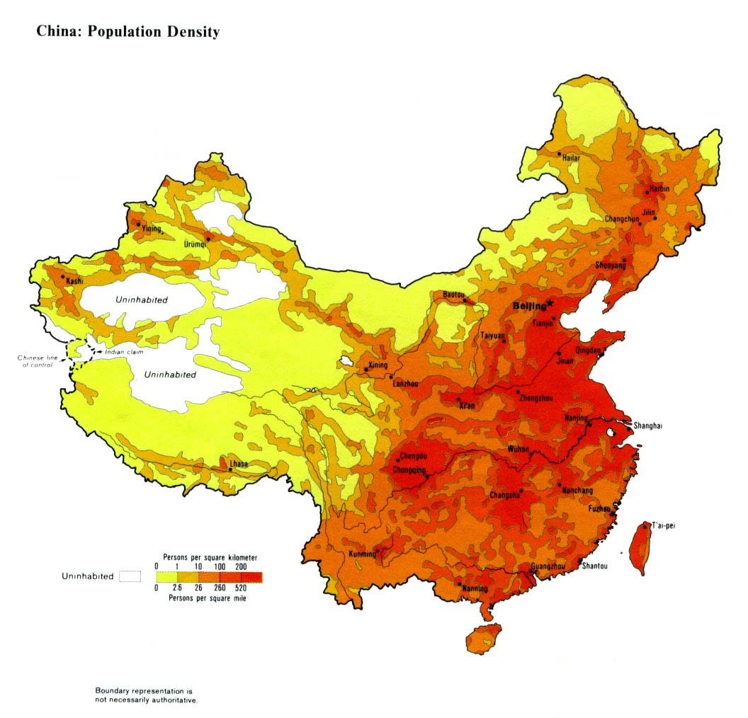
Yet the US pales in comparison to China, whose large total population and east coast economic centers bring their population density to a number nearly triple the United States average.
 a) http://www.mapcruzin.com/images/dams/-shapefile-400x254.png
b) Map of the 8100 major dams within the United States from the National Dam Directory.
c) This GIS map shows the relative location and distribution of dams built in the US. One can easily see that most are positioned on the coast or along major waterways either as an act of flood prevention or a means of generating hydropower. There is a high concentration on the west coast and the northeastern United States. This map is also used by federal agenices to delegate funding for increased water infrastructure to states or regions demonstrating need, either from lack of current dams or from an obvious need for increasing the present number.
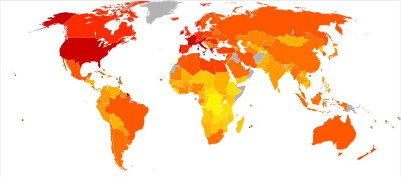
b) Map of world energy consumption (kcal/person/day) per country from 2001-2003.
c) The map is interesting because it denotes national energy consumption totals by color, the darker indicating the use of more energy per capita. Developed countries, like those in North America and the European Union, are very large consumers of electricity, the highest being the Unites States and France with more than 3600kcal consumed by each person daily. Despite their high usage of energy, they are not the largest countries in size nor population. Yet countries like China, Russia and India with much higher populations and land, use considerably less energy every day, though the present rates of use are growing to match more developed nations.